Liquid Glass in the Browser
June 16, 2025
Recently, Apple came out with its latest design system called liquid glass. It uses light reflection and refraction to create a glass-like effect that makes it look like the content is sitting on a piece of translucent glass.
The topic of whether or not this is a good design choice (see the contrast issues for yourself) is not the point of this post, but rather I wanted to experiment with the effect and how it could be implemented in the web!
Some Conspiracy
Apple has had a track record of slowing down the web and blocking some features from landing in browsers, partially (allegedly) to protect their native apps that they distribute through the app store (and thus take a cut of the revenue).
Countless modern web features have been blocked from being utilized in the web because of either slow time to implementation from the webkit team, or simply because they were deemed “not good for the web”.
This might be another attempt at making the web look different from native apps. With technologies like React Native, Flutter and others, developers tried to replicate the look and feel of native apps, with most of that effort also applied to the web.
Regardless of how “slow” or “hard” to implement some effects were in the past, the web has always found a way to implement them, but this time it seems like it is not possible to replicate liquid-glass, let’s see why.
The Effect
Let’s look at the effect itself:
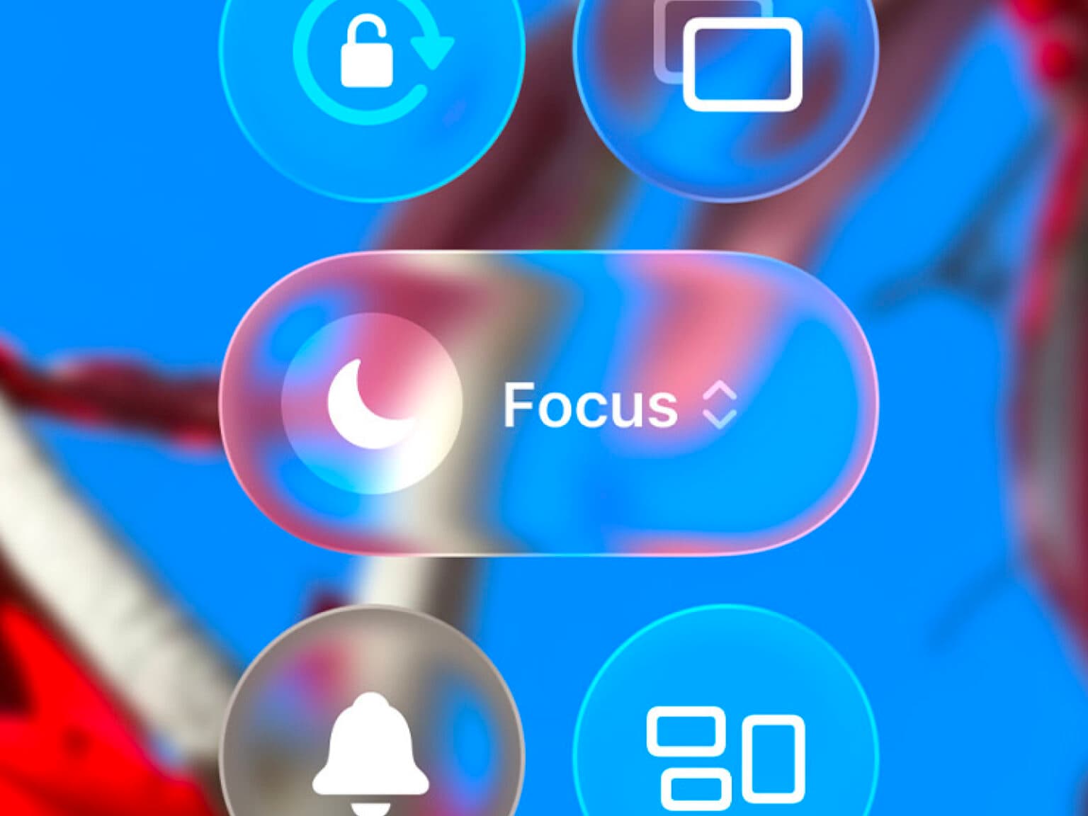
It differs from the traditional glassmorphism style that is easily achievable with a simple CSS backdrop-filter: blur(...) and a semi-transparent background color:
This effect also has some light refraction that happens on the very edges, this simulates the light bending around the edges of curved glass.
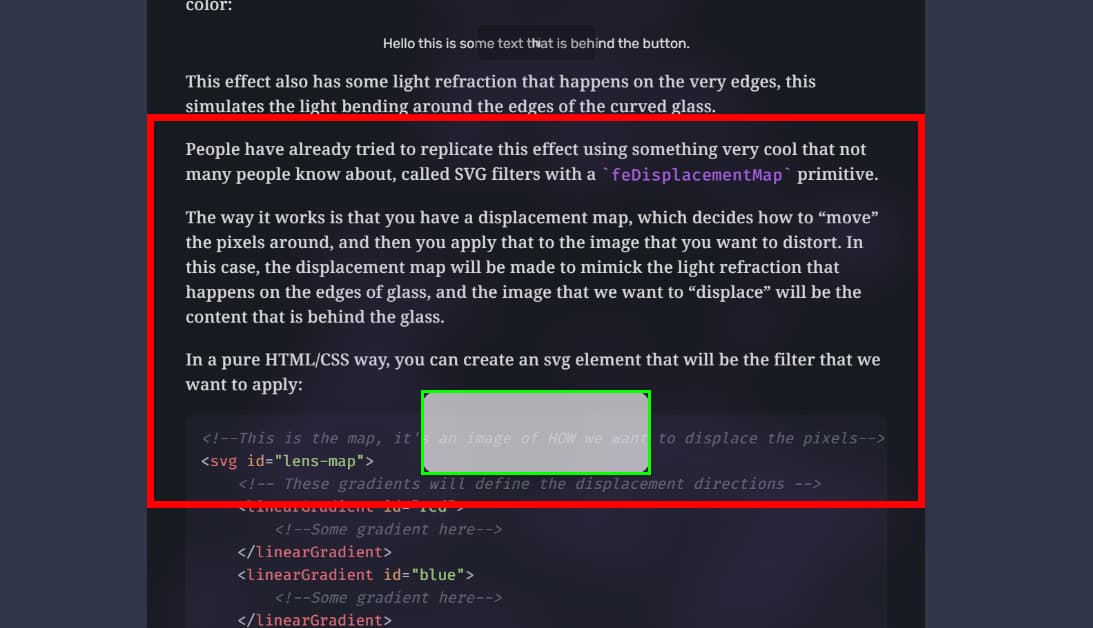
People have already tried to replicate this effect using something very cool that few people know about, called SVG filters with feDisplacementMap.
The way it works is through a displacement map. A displacement map is used to decide how to “move” (or displace) pixels around from its original location.
This displacement map is used by a filter and applied to the image that you want to distort, achieving the desired effect. In this case, the displacement map will be made to mimic the light refraction that happens on the edges of glass, and the image that we want to “displace” will be the content that is behind the glass.
In a pure HTML/CSS way, you can create two svg elements, one for the map and the other for the filter:
<!--This is the map, it's an image of HOW we want to displace the pixels-->
<svg id="lens-map">
    <!-- These gradients will define the displacement directions -->
    <linearGradient id="red">
        <!--Some gradient here-->
    </linearGradient>
    <linearGradient id="blue">
        <!--Some gradient here-->
    </linearGradient>
</svg>

<!-- This filter uses the pixel colors of the map image to distort the content -->
<svg>
    <defs>
        <filter id="my-filter" color-interpolation-filters="sRGB">
            <!-- feImage loads the gradient-based displacement map -->
            <feImage href="#lens-map" result="map" />
            <!-- feDisplacementMap shifts pixels of SourceGraphic (what we want to distort)
             based on (R)ed (x) and (B)lue (y) pixel values of the map -->
            <feDisplacementMap in="SourceGraphic" in2="map" scale="50" xChannelSelector="R" yChannelSelector="B" result="displaced" />
        </filter>
    </defs>
</svg>
I’ve left a lot of the details out as it would be too long to explain here, but you can look at the complete code here.
What we have done just defines the filter. You can then use this filter by applying it with CSS:
.your-element {
    filter: url(#my-filter);
}
This allows the browser to apply the filter to the element, and the SourceGraphic that we defined in the filter will be the pixels behind the element.
Now, the browser is able to “give” the pixels necessary to apply the filter as it’s been designed to work that way with svg filters. Those “pixels” are called the paint layer.
But say that we want to apply a more complex filter, maybe I also want to get the surrounding pixels, or I want to refract light in its prism values, or do whatever other complex effect that I want to do.
We don’t have access to the paint layer, nor in CSS or in JS, we cannot write a shader to make this properly, we cannot use fancy CSS or SVG tricks (maybe) for it.
If only we could have access to the paint layer…
A huge trick
And that’s what I thought, if we could get the paint layer, or perhaps a copy of the paint layer, we could use that information to create whatever effect we want, perhaps using shaders or JavaScript or…
And for that I present to you: html2canvas, a library to convert HTML to canvas (and then to image).
With this, we can take a screenshot of the whole page, which will be our “paint layer” that we can use as we like.
My solution
Now that we have access to the paint layer, we can do whatever we want with it.
The liquid glass effect is supposed to simulate the effect of glass, so why don’t we do exactly that?
My plan was to use Three.js to simulate the glass material by using the built in materials.
We create a 3d scene and put it as position: fixed at the bottom of the page.
We position the glass element inside the 3d scene, and then we put the screenshot of the page right below it:
In order for the effect to make sense, we need to simulate the page scrolling. We know the position of the glass element relative to the screen (the red area), and we also know how long we have scrolled the page for.
We then move the screenshot up/down so that the content below the glass element (the one in green) is exactly the content that is present below the element in the real page, this way it will seem as if the element was “transparent”.
We now have access to full 3d simulations and the background moves so that the pill is always above the correct content!
With my non-existent Three.js and graphics skills, i’ve fought the library to try to do what I was initially intending to.
After a few hours, I got tired of making small adjustments and landed on what you see currently in the page.
It does not have all the effects that apple’s liquid glass has, but it could be easily added now that we have access to our own paint layer.
We could do a shader for it, but I’ll leave that to the next person that wants to challenge themselves.
The code is available here on github and I’ve also published this silly react library to npm if you want to experiment with it.